VISUAL IDENTITY SYSTEM
VISUAL IDENTITY SYSTEM
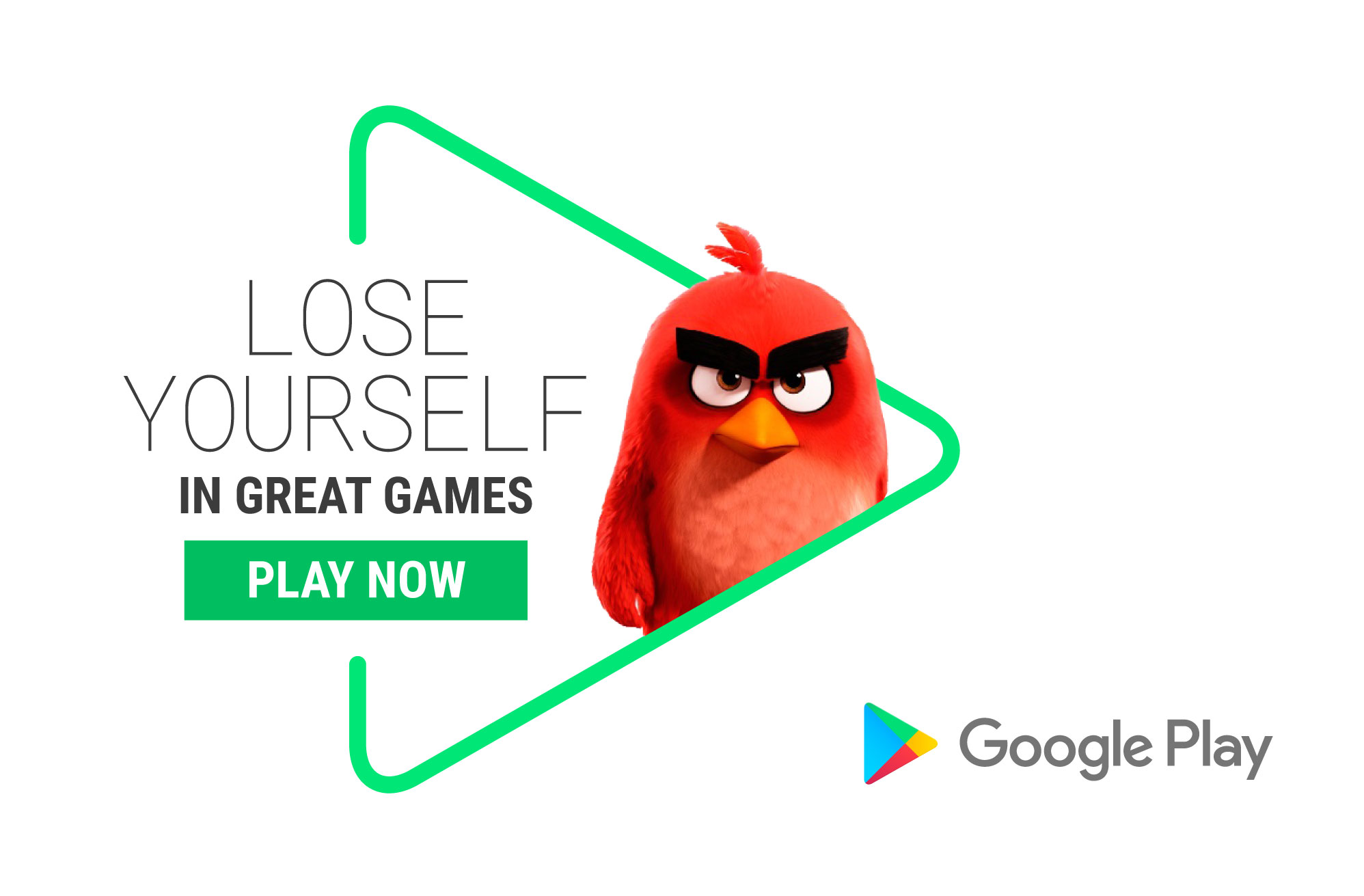
In 2016 Google Play was looking to refresh their visual identity system to establish
a more cohesive brand look and feel that could be implemented throughout multiple touchpoints through an elevated design system and clear guidelines.
In 2016 Google Play was looking to re-imagine their visual identity to create a more cohesive system and brand look and feel that could be implemented throughout multiple touchpoints on a global scale through an elevated design system and guidelines for their various graphic outputs.
STUDIO RoAndCo CHIEF CREATIVE DIRECTOR Roanne Adams
CREATIVE DIRECTOR Sarah Kissel PROJECT MANAGEMENT Simona Popvassilev CONTRIBUTING DESINGERS Noemie LeCoz, Gabrielle Lamontagne
STUDIO RoAndCo CHIEF CREATIVE DIRECTOR Roanne Adams
CREATIVE DIRECTOR Sarah Kissel PROJECT MANAGEMENT Simona Popvassilev CONTRIBUTING DESINGERS Noemie LeCoz, Gabrielle Lamontagne
STUDIO RoAndCo CHIEF CREATIVE DIRECTOR Roanne Adams
CREATIVE DIRECTOR Sarah Kissel PROJECT MANAGEMENT Simona Popvassilev CONTRIBUTING DESINGERS Noemie LeCoz, Gabrielle Lamontagne
STUDIO RoAndCo CHIEF CREATIVE DIRECTOR Roanne Adams
CREATIVE DIRECTOR Sarah Kissel PROJECT MANAGEMENT Simona Popvassilev CONTRIBUTING DESINGERS Noemie LeCoz, Gabrielle Lamontagne
STUDIO RoAndCo CHIEF CREATIVE DIRECTOR Roanne Adams
CREATIVE DIRECTOR Sarah Kissel
PROJECT MANAGEMENT Simona Popvassilev
CONTRIBUTING DESINGERS Noemie LeCoz, Gabrielle Lamontagne

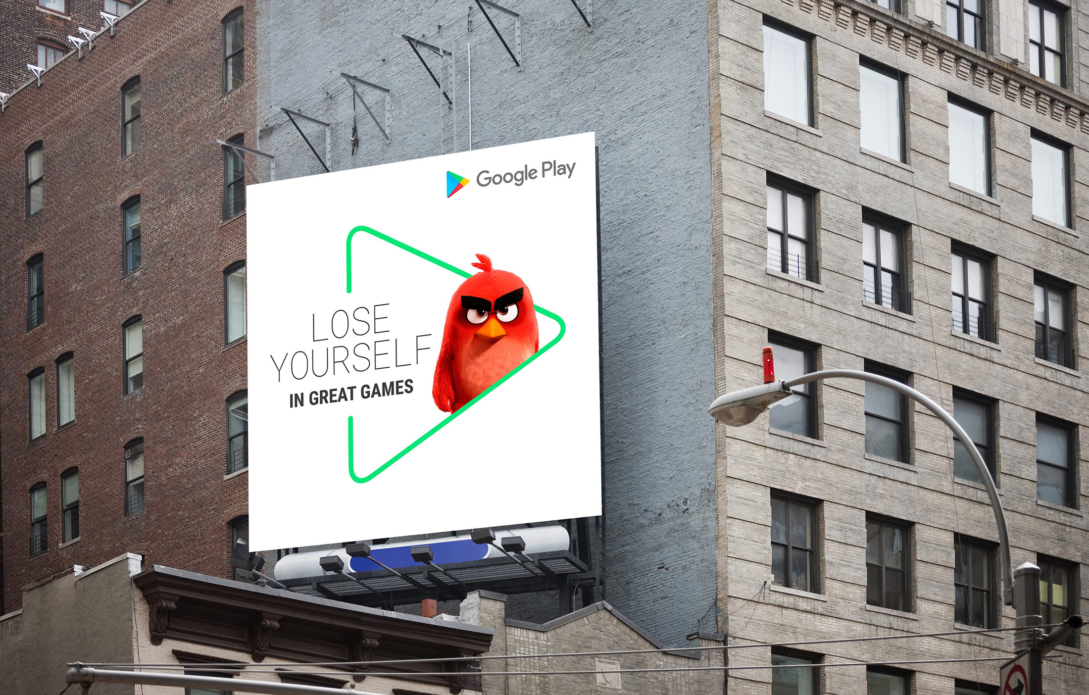
HERO GRAPHIC
HERO GRAPHIC
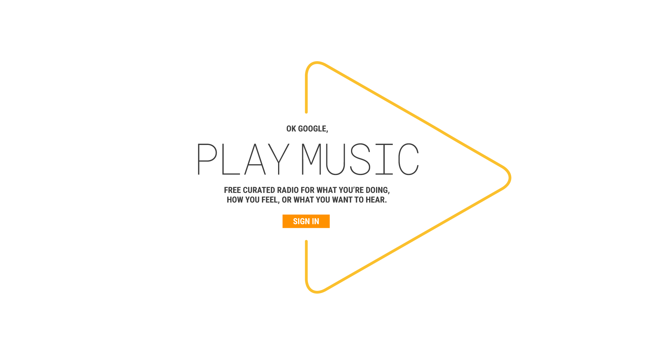
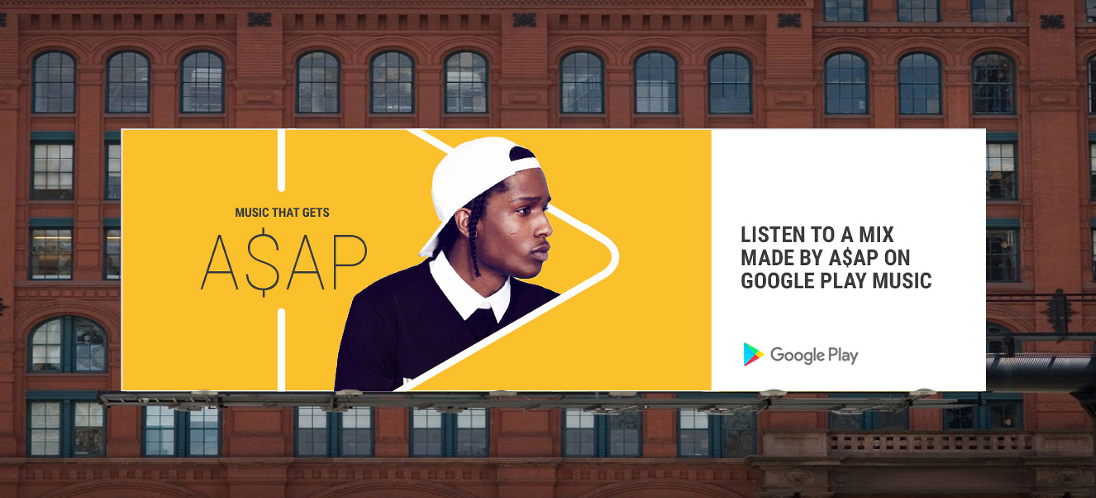
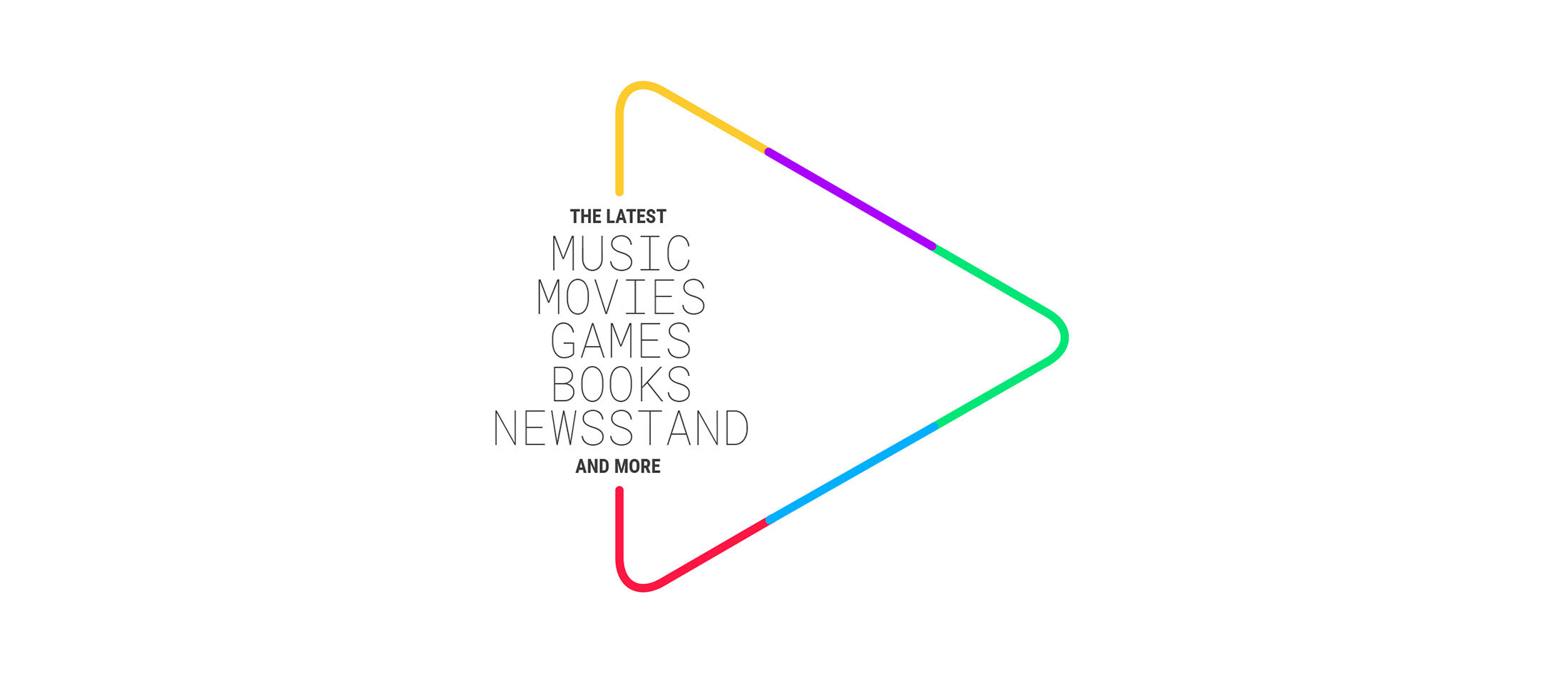
The iconic Google Prism has inspired a fresh new visual identity for Google Play, using an outline of its shape as its hero graphic. The outline houses content in various ways and plays a prominent role in the system.
The iconic Google Prism has inspired a fresh new visual identity for Google Play, using an outline of its shape as its hero graphic. The outline houses content in various ways and plays a prominent role in the system.
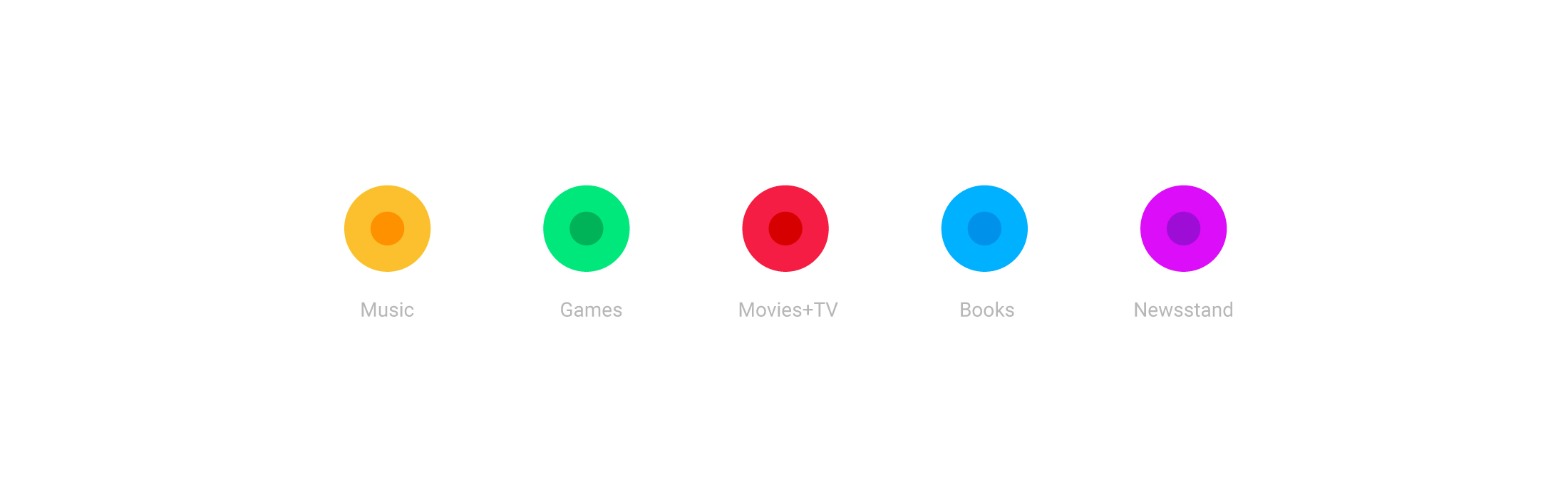
COLOR
COLOR
The new identity's color palette was informed by the five Google Play vertical icons for Music, Games, Movies, Books & Newsstand.
The new identity's color palette was informed by the five Google Play vertical icons for Music, Games, Movies, Books & Newsstand.
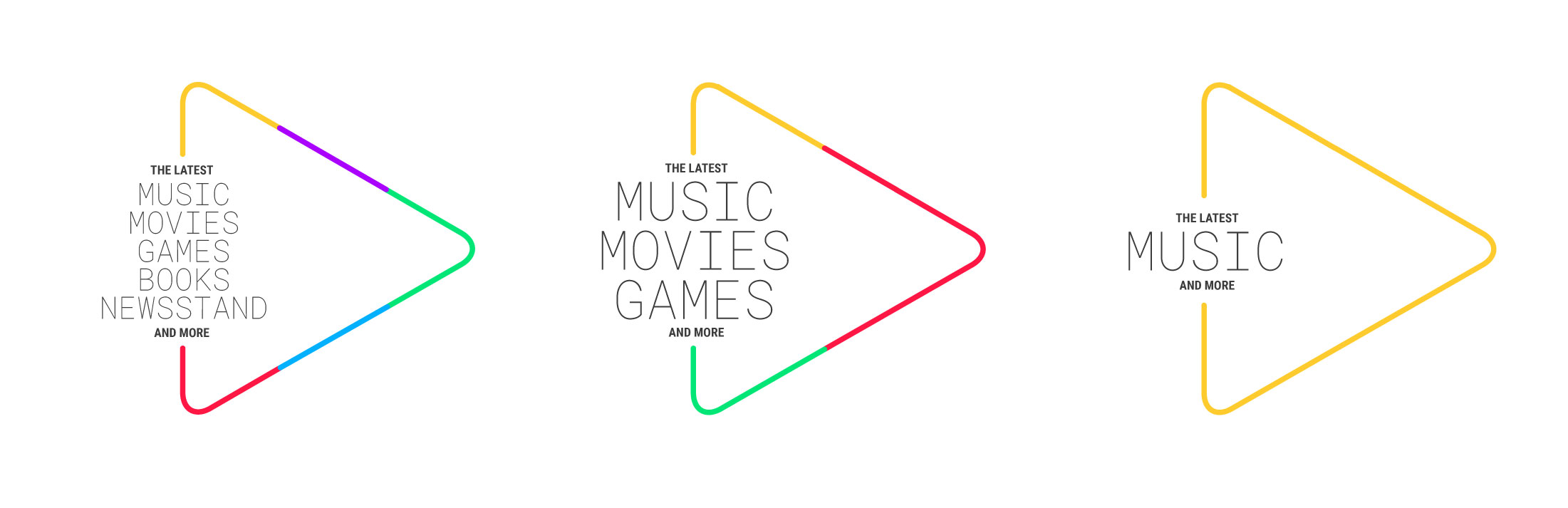
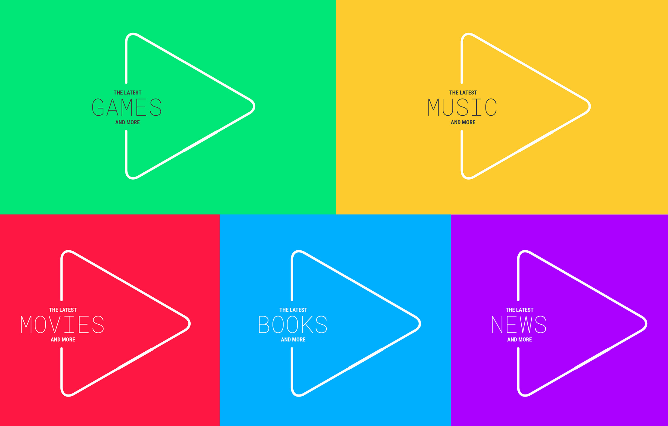
COLOR TREATMENT
COLOR TREATMENT
The hero graphic is designed to take on various color combinations, depending on the featured vertical content. For certain applications, vertical colors are used as background floods.
The hero graphic is designed to take on various color combinations, depending on the featured vertical content. For certain applications, vertical colors are used as background floods.
TYPOGRAPHY
TYPOGRAPHY
The typographic system uses a combination of a thin cut of
Roboto Mono and a bold cut of Roboto Condensed.
The typographic system uses a combination of a thin cut of Roboto Mono and a bold cut of Roboto Condensed.
Selected Works

AlgaeCookingClubBrand Identity / Art Direction / Packaging
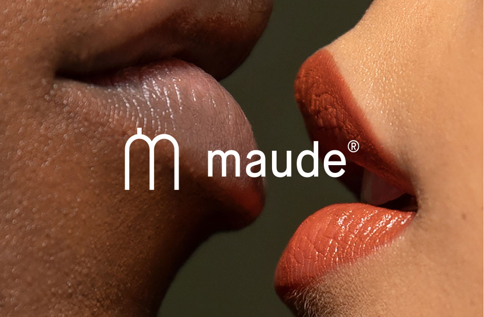
MAUDEArt Direction

TwoFrontBrand Identity & Packaging
InfiniteBrand Identity
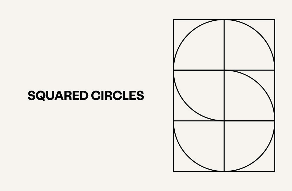
Squared CirclesBrand Identity
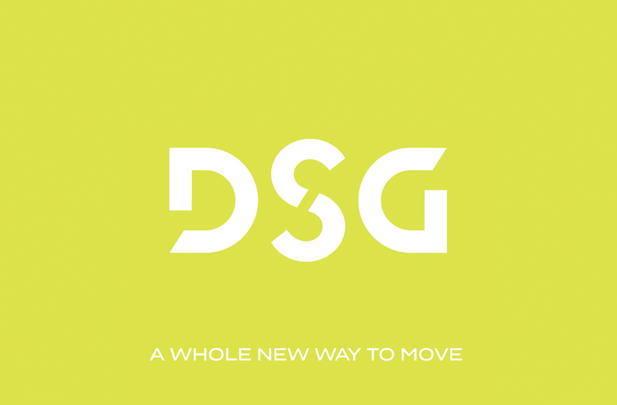
DSGLogomark & Art Direction

MAVEMADEBrand Identity & Packaging
AIR COMPANYBrand Identity
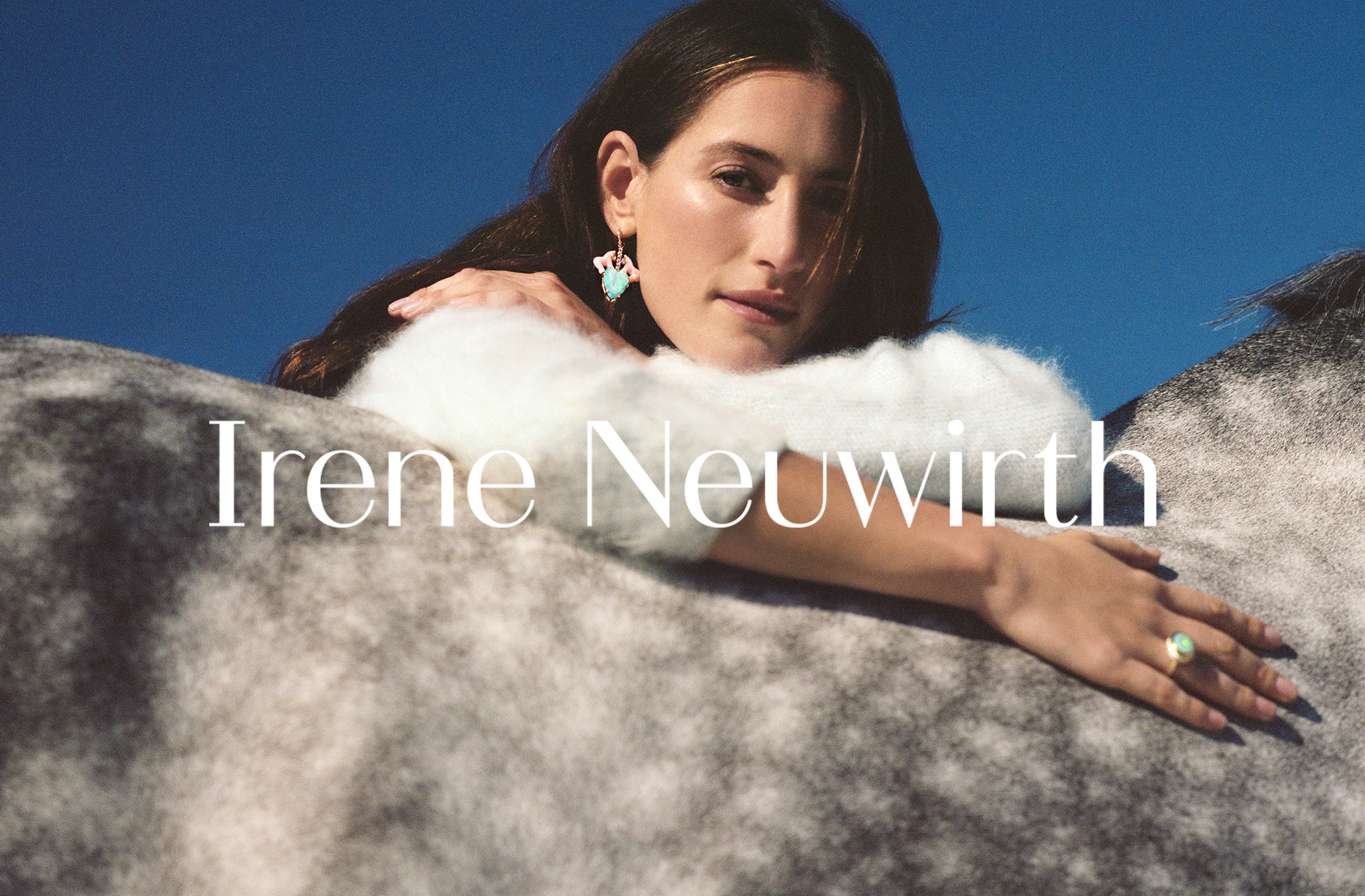
Irene NeuwirthArt Direction
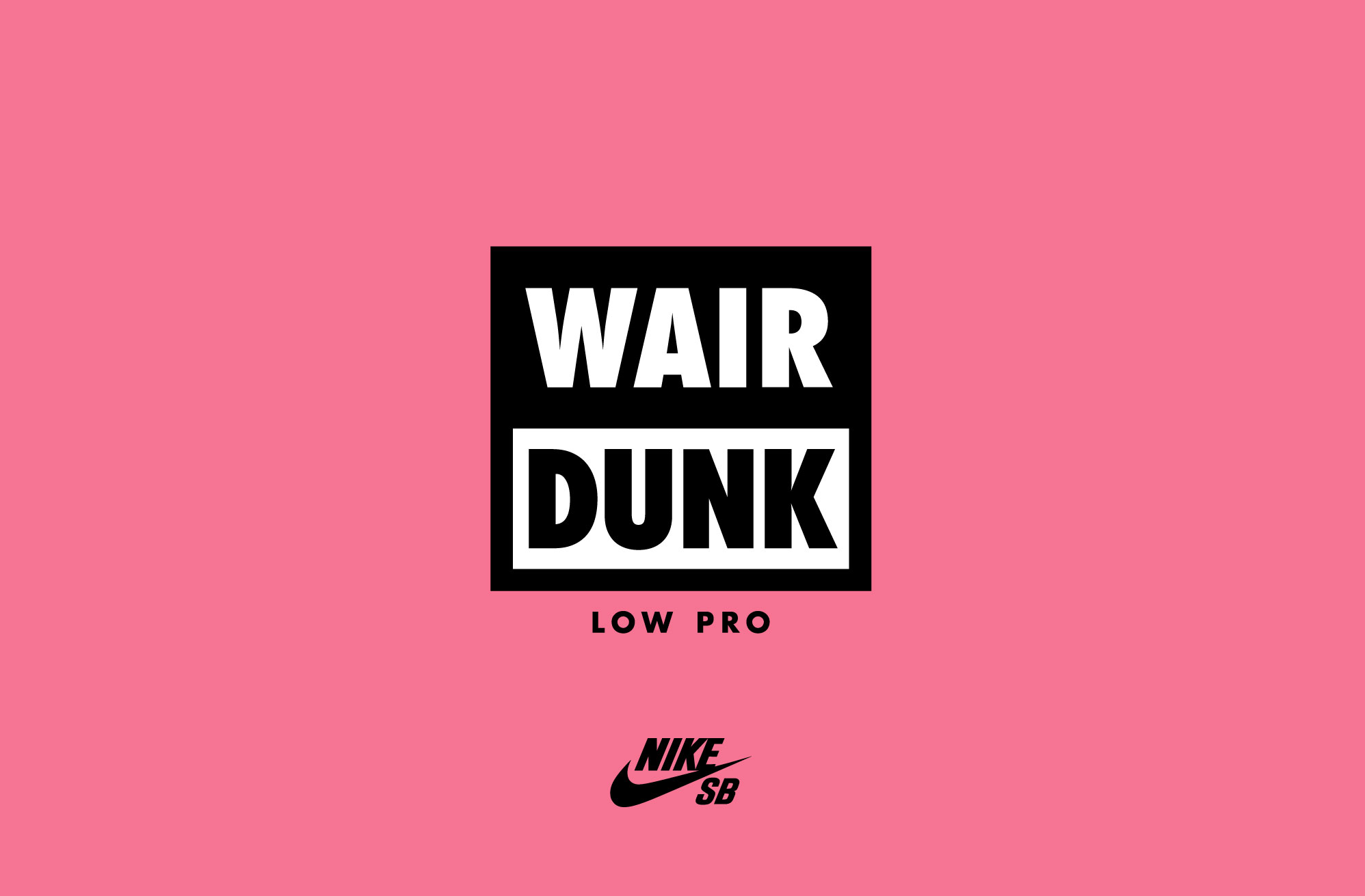
Nike SBCampaign Graphics
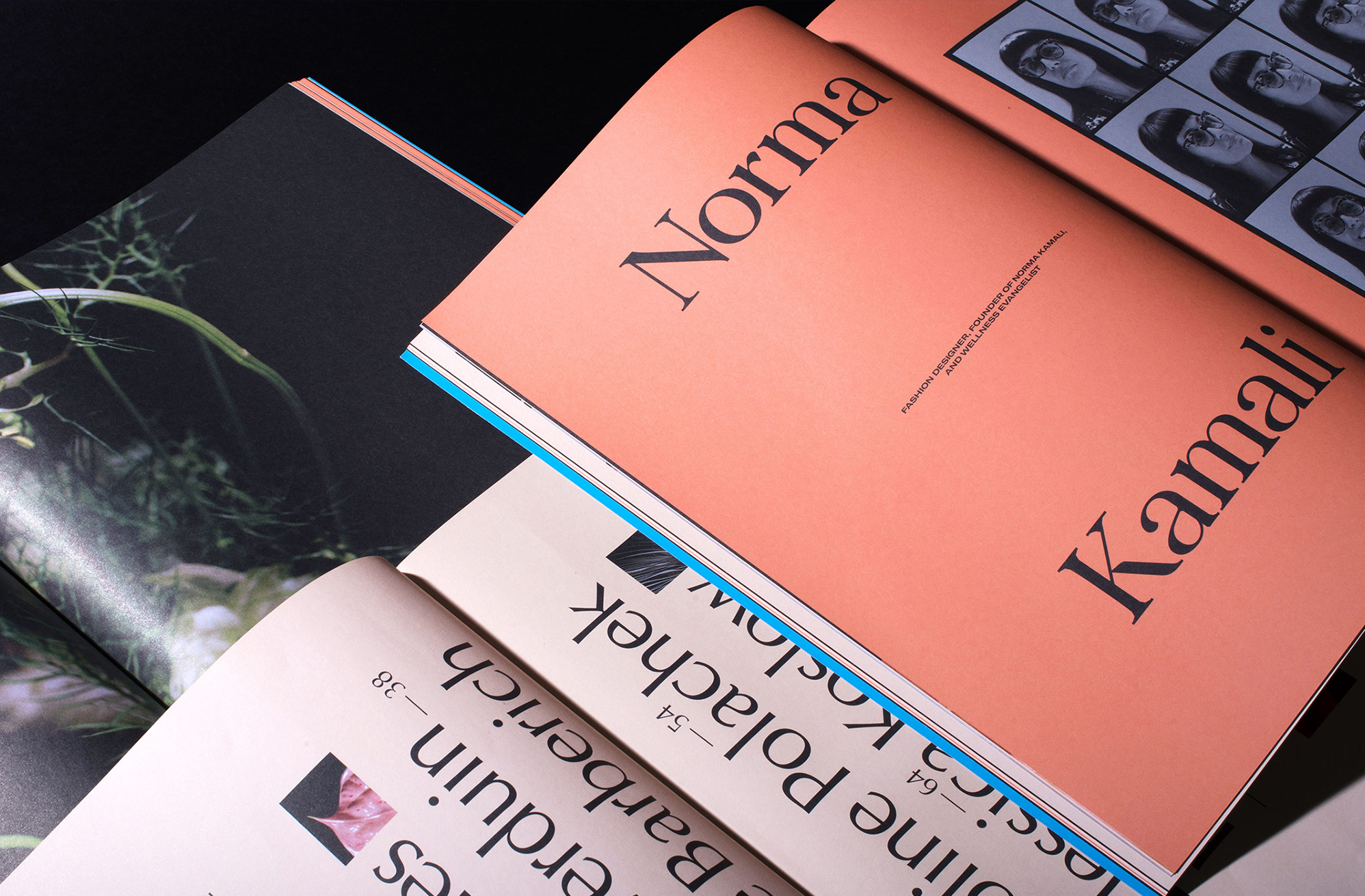
Romance JournalEditorial Design, Brand Identity

Aeijst – Styrian Pale GinBrand Identity

The InsideBrand Identity
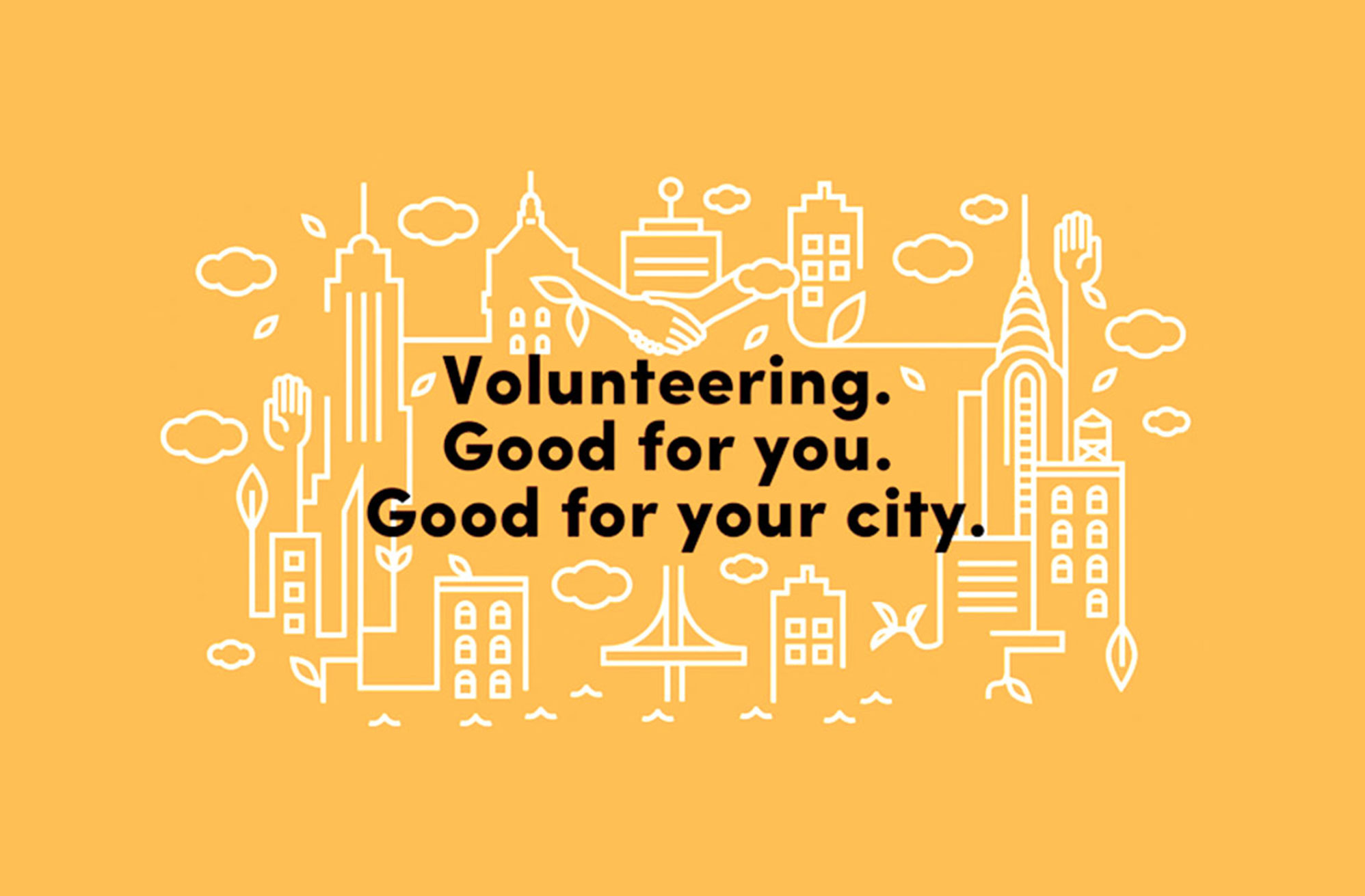
NYC ServiceIllustrations
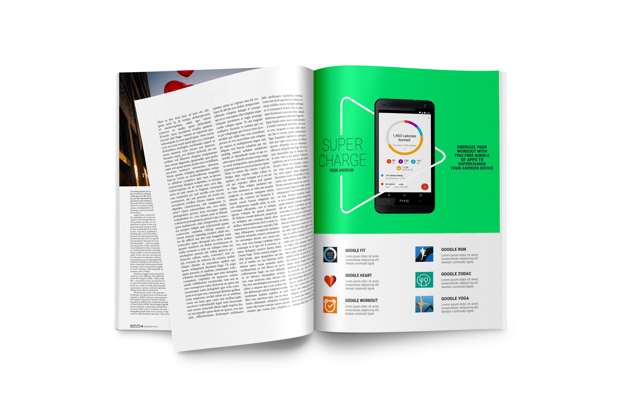
Google PlayVisual System
NowServingBrand Identity

AMURBrand Identity
Dina&OmarDesign / Illustration

VariousProjects